Showing posts with label coloring. Show all posts

Tuesday, April 1, 2014

Tutorial - Adding White Highlights

Today I have a short little video showing how I like to add white highlights to the digi images that I color.  In my video I used the digi stamp called "Peter".
For many of you this won't be a "new" idea, but hopefully some of the pointers or products I used will be helpful to you.  And for some of you it will just be a nice reminder of a little touch we often forget to add. 

I hope you enjoyed the video.  If you have any trouble clicking the video above you can see the video at this link

Tuesday, December 3, 2013

Tutorial - Creating and snowy or starry night sky

Happy Tuesday everyone!

Today I have a long lost video to share with you.  Somehow this one got buried in the video vault but thankfully it is found now and can be shared with you.

In this video I show you how to create a starry or snowy night sky on your colored digi stamps.

If you have any trouble viewing the video by clicking the above you can use this link

I hope you enjoyed our tutorial.  

Tuesday, January 24, 2012

TUTORIAL TUESDAY - an economical, foolproof way of "chalking"

Hi there!  It's Jen here, from the Shelly's Images Design Team.

Today, on behalf of Shelly and my fellow Design Team members,  I would like to show you a way of chalking, around your image, or on dry embossed cardstock in a really economical way.

Chalks are pretty expensive, and a good range of colours will cost a pretty packet.  So I popped off to the bargain store and purchased a set of eye shadows, the powder type, in a selection of really bright, soft pastels, and some lovely metallic colours.  It cost under ten dollar for a set of 48 fabulous colours! 


This is the picture how-to:

Select your image, and for the purpose of this tutorial, I have used the very pretty image called "1st Birthday" available in the Shelly's Images Store HERE.


Really simple, isn't it!  Now there is no need to throw out those eye shadows are are past their 'use-by' date.  Transfer them from your vanity area to your craft area, and give them a new lease of life!

Have fun trying out this technique!

luv'n'huggz

Shelly and the Shelly's Image Design Team

PS - There is still time to enter the challenge and stand the chance to win!
Please pop back on Thursday, ... it promises to be "Terrifically Thrilling" ...!

Tuesday, November 1, 2011

Technique Tuesday - Custom Ribbon!

I don't know about you, but I LOVE RIBBON (and buttons and bling and and and.....LOL)

I'm always looking for something uniquely different that I can do with ribbon I have in my stash and today I'm going to show you how to PERFECTLY MATCH your ribbon with your projects.

How to do that you may ask?

Well, grab your favorite ribbon and an Alcohol Marker of your choice (use copics), a piece of thick scrap paper (I used kraft, but anything with some substance to it will work) to keep your table clean and let's get started.
 Determine how much ribbon you'll need and start coloring - I used the broad end of the marker to color. Be sure to color on the scrap paper because the ink WILL LEAK THROUGH!

Color the amount of ribbon you need - as it dries, it will become uniform in color.

Once it's dry, use it on your project and get creatin'!

Just a quick note - your ribbon will likely become a little stiffer after you color it - just be patient & work with it--you won't be sorry!

So far I've tried it on this heavier ribbon, as well as the whispy see through ribbon (can't for the life of me think what it's called). So, now I have a variety of white ribbon in my stash that I can color up at a moments notice and is perfect for ANY project I do! =)

Here's a little snippet of the orange custom ribbon I did for this week's Challenge project -
Check back on Thursday to see the whole project!
Hugs & Happy Days!

Tuesday, October 18, 2011

Tutorial Tuesday - Paint and Salt Technique

Hi everyone!

Crafting is so fun and such a creative outlet.  But sometimes I get a request that is SO FAR out of my comfort zone.  Last week one of my husband's friends asked if I could make a Zombie Anniversary card for him to give to his wife.  Yikes!  First....of course I needed to come up with a zombie digi for the card.  And second....how in the world do I make a zombie anniversary card?  I think of anniversary cards as having lace and hearts and flowers.  Well, I was determined not to let this challenge get the best of me.  And I really ended up very pleased with both the Zombie Love digi and the card that I made to help them celebrate their anniversary.


 I thought the paint and salt technique was the perfect addition to give a background to the Zombie Love digi. I hope you enjoy learning this technique.

 First, let's gather just a few supplies.  I like keeping a water spray bottle at my craft desk so that is what I am using here.  Of course a little cup of water will work fine too.  I am using black acrylic paint for my project.  This technique also works for watercolor paints and even Sparkling H2O's.  Really any water based paint will probably work.  And I am using the Zombie Love digi printed on high quality paper.  I would recommend testing on a small piece of paper to see if you get the result that you like.  There are lots of good quality papers available and water color paper would be another great choice.  Last but not least...head to the kitchen and grab your handy salt shaker.  


To start wet the paper.  You don't want it to be sopping wet but just evenly brush water over the paper.  I am being careful not to extend the water into the actual image space.  

Now mix the paint with quite a bit of water.  Remember...you can always make the background darker, but it is harder to make it lighter.  In this step getting the paper wet enough is very important.  After a little experimenting I found that it was best to do the whole area around my digi at once.  It was too difficult to match the color when I tried painting, salting, and drying sections.
 Once the entire area is covered with paint and is nicely wet you can begin adding salt to the surface of the paint.  BEWARE!  I am still finding salt in my studio.  It might be nice to do this step over a cake pan or plastic dish to catch all of that extra salt.
 This picture shows the salt over the entire background.  
 Now use your heat embossing tool to dry your paper.  Be careful, you don't want to burn or brown the salt here.  We are just trying to dry the paint and paper.  As the paper dries you will begin to really see the cool background that you have created.

 Once the paper and paint are dry use your fingers to completely remove the salt from the surface of the paper.  Just wipe across the salt to rub it off.  Caution is advised here too.  This is another place where the salt seems to take over your craft space.  :)
 
 Here is my finished background and colored image.  
 

Tuesday, August 2, 2011

Get your Markers ready for a TUTORIAL

Do you ever need bling and the colored bling that you love and cherish in your stash just DOES NOT match your project no matter WHAT you do??

Well, have no fear, with your clear diamond type blingy and a Copic marker, you can switch up the colors in no time flat and have that PERFECT matching bling.

What you'll need:
Copic Marker Color of your choice
Clear Bling of your choice
(The ones I used for this are by Hero Arts however bling from JoAnn and Michaels work just as well!)
Take Your Bling (I keep mine on the plastic sheet it comes on until I've achieved the results I'm looking for). 

Now comes the FUN part - COLOR your Bling - you may have to color several times to achieve matching color.

Let dry for a few minutes (doesn't usually take long, but once you've achieved the perfect color, you don't want to miff it up).
Remove from plastic sheet and adhere to said project that needed matching bling and
 - VOILA - the PERFECT MATCHING BLING!
You'll have to wait until Thursday to see the ENTIRE final product - but here's a little sneaky peek!
***NOTE: This may work with OTHER types of markers other than Copics, but I have only tried it with Copics.  I would THINK that this should work with other alcohol based markers as well.***

Look at that - it's that's easy and you have perfectly matching BLING!  =)  Let me tell you - when I figured this out I was ONE happy girl - NO MORE looking for the perfect shade to match your project and being denied again!!

I hope you give this a try & love it as much as I do!
Hugs & Happy Days!

Tuesday, July 5, 2011

Technique Tuesday at Shelly's Images

Hi again! I'm back with another exciting post! This time I'm here to share another super functional tutorial!

Ever working on a card or project and realize at the last minute -you don't have the right color ribbon, trim, or embellishment for it? Yeah...well, I definitely have had this problem! However, being the frugal (aka: perpetually BROKE) sort, I have found a way to ALWAYS have just the right color ribbons and flowers on hand - whenever I need them! I buy mostly white or ecru ribbons and embellies & DYE 'em to match! Curious? Well, here is how I do it!

Materials List:
Mixing containers - I used recycled pudding cups.
Ribbon/Lace/Twine/ Fibres, etc.
Paper/Silk/Felt Flowers or shapes.
Reinkers -  ie: water based, alcohol-based (See the list at the end for how to prep each type!) 
Water and/or Vodka (depending on ink type)
Optional - spray starch, oil, Non-Alcohol baby wipes, curling iron, protective sheet for work area, tweezers, drying rack.

Step 1: Gather the materials you want to dye. Felt shapes, ribbon/twine/lace of any sort, paper/silk flowers. Anything that is absorbant will do!
Tip: Ribbon and lace are often starched, so you might want to rinse it with clean water and hang it to dry so it will properly absorb color. If it feels stiff...it's probably starched!

Step 2: Gather your Dyeing tools and materials. Be sure to check out the info below as different inks require different additives! I used Stampin' Up REinkers, but there are a wide variety of inkers available - just find out wheather they are water or alcohol based inks and you should be all set!

Step 3: Place a few drops of ink in your dyeing container.

Add a little bit of water, and gently swirl container to mix.

Add your material.
Tip: You can always add more later...but you can NEVER take it away...so use your supplies sparingly! You don't wanna waste ink but you also don't want a full spool of ugly ribbon!

Step 4: Gently squeeze out the excess dye. I do this with my hands, and then use a baby wipe to remove more of the color before hanging it to dry. The longer your material is left soaking, the richer and deeper the color will be. Wear gloves if you are going anywhere in the next few days...the dye's stain skin pretty badly! 


Tip: My 'drying rack' is a part of an old shoe rack! The legs got lost during one of our moves, but it still serves a great and useful purpose! You should be able to find one at goodwill if you want one.

Step 5: Once my ribbon and embellies are completely dry, I can use them! To speed up drying time you can also spray them with starch and hit them with some air from a HOT hairdryer. A fun & frugal way to make functional embellies for your projects doncha think?!

Copic Various Reinkers, Rangers' Adirondack (Tim Holtz) Alcohol Inks, and many others are Alcohol Based. I disperse the ink color by dipping the item in Vodka before adding them to the dye mixed with 1/2 water and 1/2 vodka. Vodka carries no scent and evaporates quickly. (So your materials will dry quickly!) They are usually very stiff too, and will not require any starch. Using a steamy curling iron will help straighten your dyed ribbon and lace. Just move SLOWLY as they are not as stable after dyeing. If you notice they are giving off color after drying, blast them with hot air from your hair dryer to set the color!

Tuesday, March 22, 2011

Technique Tuesday at Shelly's Images

Good Morning everybody! Hope you are ready for another quick and easy tutorial from me! This time I'm going to show you how to softly sponge chalk your backgrounds to add something extra to Shelly's Images exceptionally gorgeous digi's! :) As always, your super frugal friend Scrappy is going to show you the easiest and cheapest way to do it too!

Supplies Needed:
1. cheap-o dollar spot Chalk Ink(s) in whatever color(s) you like
2. makeup wedges
3. your colored image
Optional: scrap paper/cardstock to work on, sm. aerosol can of hairspray, baby wipes (for cleanup!).

Step 1:  Gather supplies and cover surface to avoid getting ink all over. FYI: Chalk ink, while beautiful can be tricky and may smear and stain. A spray fixative helps to reduce smearing when you are done sponging. My advice? Use cheap aerosol hairspray! A thin coat sprayed from a foot or so above the image does the trick and is alot cheaper than a can of $6.00 Krylon or 3M!

Step 2: Bend makeup wedge slightly and dab it onto ink pad. I like the makeup sponges because they are super cheap, and they hold just enough ink to not create a mess! I also like them, because sometimes you can use the other side for another color on your project! Note: Makeup wedges can be found at pharmacies, beauty stores, and online for about $1. for 32+!

Step 3: Starting on the outside corners of your colored image, stroke the wedge all around the outside edge. Overlap strokes slightly and lightly continue all around your image. Go over it lightly the first time around, and repeat as desired. You can always add more ink, but once it's there it's there permanently. DO NOT try to brush excess away! It will smear and ruin your image!

As you can see, the edges will be darker and the chalk will be naturally lighter around your image. This sort of 'Halo Effect' serves to highlight your beautiful coloring! It also may help to hide any coloring imperfections!  
 Below is the image with most of the sponging complete! Of course, you'll have to wait and see what I'm making with my gorgeous Shelly's Image!  In the meantime, why not try chalking/sponging yourself! You'll quickly see why I LOVE this technique!


I hope you enjoyed my tutorial! :)

Don't forget Thursday's TTT Challenge is still open!
Click HERE to check out the details

Tuesday, December 21, 2010

Technique Tuesday at Shelly's Images

Morning everybody! Hope you are ready for another pretty fun tutorial from me! This tutorial idea is partially in response to a question someone asked me about a project I did with Shelly's Images Balloons. However, now I am applying it to this weeks Marvelous Monday Image - Minutes to Midnite!

I have been asked a few times how I color things to make certain parts opaque and other parts translucent. I thought it would be easy to explain in my emails back and forth with one or two of my blog readers, but alas it was not! So here I am with my own coloring tutorial! The funniest part of this is that I've never taken a formal Copic Class, or anyy sort of art class in many years. Pretty much all of my coloring techniques have been trial and error and trying to mimic what I've seen others do!

So for once, I'll hush and get on with the tutorial! :p

First, I gathered my supplies: My printed image of Minutes to Midnight, Copic Markers (in 0, BG10, C1,Y28, 100), Ultrafine tip Black Sharpie marker, Sakura Gelly Roll Pen (gold), Gel Writer in Clear Silver.

I also gathered a few glasses to see how light hit them when they were placed in my light box. The glass to the right in the picture looks most like the one in Shelly's awesome image, so I used that one. If you look at the glass in the picture, you will see the shiny spots where the 'natural' light hits it (actually I use a clip lamp!). Those will be shown with a slight absense of color later (You'll see!)


Since it is clear glass and champagne is not opaque, you'd see a vague colored shape of the clock behind it. So I made note of the shape in the thicker bottom of the glass where the curved glass 'bowl' meets the stem. This is important because things seen through this are concave or convex when seen through it. In this case it is convex nearest to the eye, so the clock behind it would blur slightly below the very bottom edge of the bowl. So why all this science? Simply, because not everyone can unfocus their eyes, picture the image, and color as they go along!  I shaded in the inside glass curve with my Cool Shadow (BG10) Copic.

I followed that up with my C1 Copic closer to the drawn lines, especially nearest to where glass is naturally darker/thicker. (See picture to the right.)
I use a pretty light hand to start, and get progressively darker with each overlapping stroke. Copics blend very well on their own if you work quickly while the previous stroke is still somewhat wet. If you mess up, you can usually sort of bleach it out using the Copic colorless blender. Draw the colorless blender brush tip from the outside of where you mistakenly colored,  and draw the color into the area wher you want the color to be. Like magic, the mark will usually lighten and disappear! If not wait 'til it dries and repeat.

I used my  Lionet Gold Copic (Y28) to color in my glass below the champagne surface and used the same color to color some of the clock behind my glass. I hadn't yet decided what color I wanted the sides of the clock, so I was careful to leave the empty top of the glass clear. The darker areas of gold are where I applied the same marker with more than one stroke!

Now I'm sure if you've ever used Copics, you've found out that they don't always play well with other stamping supplies! Mix them with the wrong inks and they run together! After alot of screw ups, I learned to make this work to my advantage!


I used a Sharpie Marker to fill in the fine trim on the clock - including through the glass bowl of the glasses! Note that at the second glass I curved the color under the convex curve to make it look more realistic. It is especially evident because the clock corner meets just beyond it! ALWAYS use your Copics to color first and your Sharpies second!! Why? Simply because in one shot a Sharpie will destroy your Copics! Besides, Sharpies are ALOT cheaper and easier to replace than Copic Nibs!


Next I added a bit of color and shimmer with my Sakura Gelly Roll Pen (not sure of the color name - but it's gold tone). Again, I added more color along the outside edges, and left few spots of darker shimmery shading where the 'bubbles' would be! In this picture you can see how my coloring isn't perfect, but I can easily fix that later with my Colorless Blender. You can also see how the Sharpie and Copic are feathering together to make the clocks base behind the 'Champagne' vaguely visible through the translucent gold.


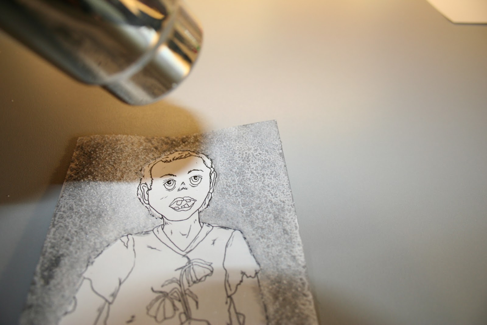
 Next I added some silver gel color with a gel writer pen. Since this gel is mostly opaque, I used yet another of the 'Mistake Techniques' I picked up...
I smeared the gel ink so leave a barely there shimmer across my champagne surface. As odd as it seems though, this can be tricky! It you go over the lines of the image or get the gel ink anywhere you don't want it - it is NOT usually fixable!

I usually use alot of different colors in one image. But silver and gold together are just fantastic when used right! What better to show this on than in Champagne!

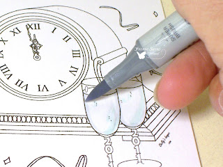
Once I'd decided which color I wanted to use on for the clock case, I shades in the glass above the champagne level with my Cool Shadow Copic (BG10). I knew I was going to color over it with another color - at least in some parts. However, I've learned that base coloring it with the Cool Shadow makes the other color lighter in that area without adding color or using a different marker for shading.

Once I colored the 'glass' and quickly grabbed my Lionet Gold Copic (Y28) and colored in the clock case behind the glass. I used two to three layers of marker strokes on the case, and 1 stroke over the 'glass' where you would see the clock through it.


I also shadowed a darker line where the gold beveled edge of the clock would be seen through the champagne glass. The Champagne is VERY shimmery, but you won't be able to tell from the picture yet. It is still a tiny bit wet and I'm trying to be careful as to not smear it!

Next, I added a ring of Cool Shadow around the base of each glass and drew a slight shadow in front of the clock. I would also later add another layer of shading with my C1 Copic. Are you starting to see the depth in the picture after just a few tricks?


Once my shimmery Sakura Gelly and Gel Pens were dry, I was able to handle the image alot easier! I've turned the image on an angle and directed my un'natural' light on it to show you the shimmering champagne color! What do you think? Does it look real enough?

After completing the coloring on the rest of the clock, I die cut and added all of the rest of the embellishing I'd decided on.  Then VIOLA! I was done with my card below! I'd appreciate any comments on this tutorial and on my card either here or on MY BLOG. Thanks! Scrappy-SI DT Family


Don't forget Thursday's TTT Challenge is still open!
Click HERE to check out the details